Selecting the right charting option
In the previous chapter, we saw some different ways to create a chart, and dashboard charts are no different. Indeed, we can create bar charts, stacked bar charts, line charts, donut charts, funnel charts, and scatter charts. Gauge and Metric charts are not available on the report charting options.
The Gauge chart is used to have a precise look at how your metric is performing against a given range.
Create an opportunity report that shows the current year’s opportunities and summarizes the Expected Revenue field. Now add a new component to your field and select an appropriate range on the Component Range property:
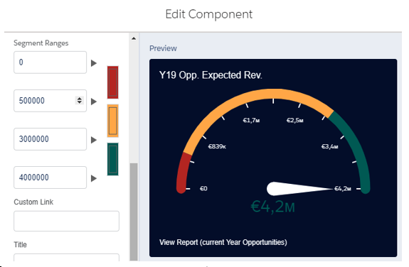
Gauge chart configuration
The Metric chart is easier than the gauge chart because it simply displays a number that is the most important metric to be evaluated: it can be customized with show different colors based on a given range.
By using a simple case report that displays the number of open cases (a single filter on the Closed field filtered by the false value) and inverting the range colors (our error condition is when there are too many open cases), you get to the metric chart configuration:
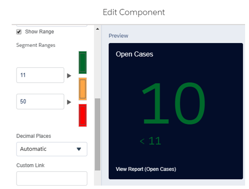
Metric chart configuration
Rearranging components on our new dashboard and putting sales reports and service reports in line, we’ll get to the following production-ready dashboard:
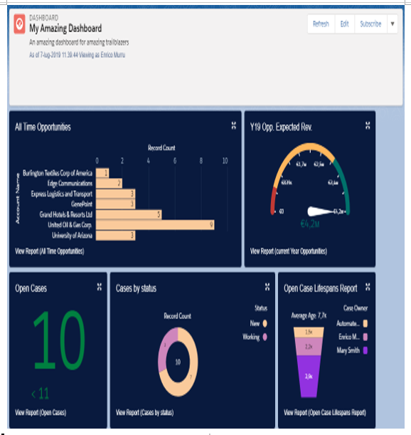
Dashboard example with different components
Remember that if you have already created a chart on a given report, you can use that chart instead of configuring it at the dashboard component level by selecting Use chart settings from report on the component editor panel.
If you want to explore all available components settings in more detail, refer to Salesforce Help at https://help.salesforce.com/articleView?id=dashboards_components_edit_lex.htm&type=5.
Another option when building a dashboard component is the chance to add a tabular view to your report by using the lightning table display format (in the following example, the source report is a simple account report):
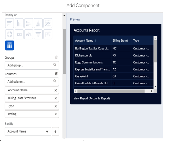
Lightning table component format
The table can show up to 200 records and 10 columns from the source report type.
You can select the columns and sort order for ungrouped reports, but you can also group by a field (in the following example, by Billing Country) and add measure fields (such as the min/max of the accounts’ Annual Revenue field in the following example), or even formula columns defined in the report:
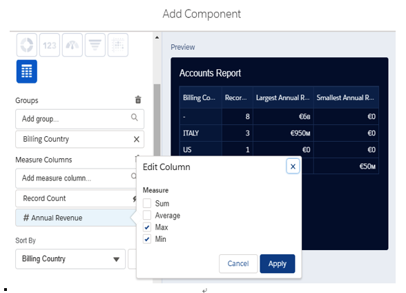
Lightning table example
One last thing to note is a great integration with Chatter: you need to enable Feed Tracking from Setup | Features Settings | Chatter | Feed Tracking, choose Dashboard, and click Enable Feed Tracking (and select any other field change you want to see on the dashboard’s related Chatter).
Once tracking is enabled, to access the dashboard’s Chatter, click on the new feed icon left of the Refresh button (we can also see that a + Follow button has just appeared):
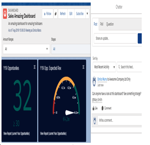
Chatter feed on dashboards
The cool thing is that by clicking the four-arrowed icon in the top-right corner of each component, we can download locally or share the component image on the Chatter feed to start collaboration on dashboards too:
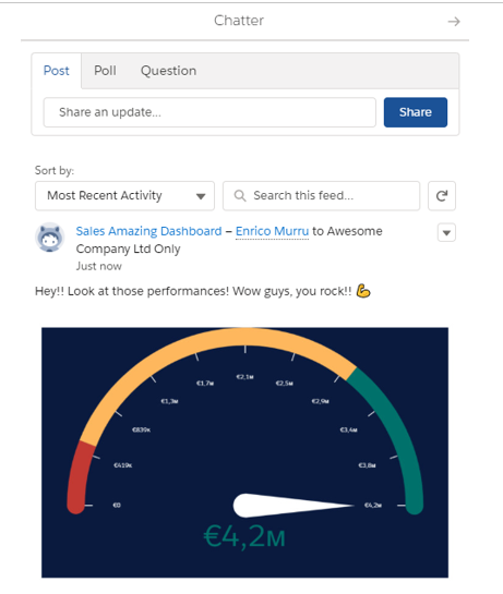
Sharing a dashboard component’s image on the dashboard’s Chatter feed
Lastly, you can embed dashboards on any app and home lightning page by using the Lightning App Builder and the dashboard standard lightning component. Simply add the component to your page and select the dashboard to be embedded (it has to be in a public folder):
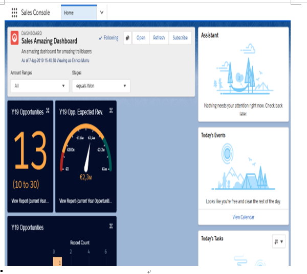
Embedded dashboard on a home lightning page
So far, we have learned how to build a dashboard and configure most of its features. In the next section, we’ll be talking about how to filter dashboards.
